An app for listening to audiobooks in Japan.
Our most promising customer for this audiobook service is a typical Japanese salaryman – let’s call him Kenta.
Picture him walking to a local ramen shop, he’s looking for a quick bite to eat before rushing back to work. Kenta’s flip phone rings and he picks it up – it’s his boss. Boss man is calling Kenta to remind him to send a document he missed for the health ministry. Once at the restaurant, Kenta takes out some bills and coins from his wallet and pays for his food. He inhales his dinner and heads back to the office. Immediately, Kenta finds the missing document, stamps it with the business hanko, and faxes it over to the city. When he’s done work, he has a few drinks with his boss before taking the train home. He’s wrecked from the long day but is too wired to sleep. To relax, he plays his favourite Arashi CD on his stereo and passes out.
Anyone outside of Japan might mistake this scene for the 1990s — but I’m quite literally describing Japan in 2019.
Yes, it’s true. Fax machines, flip phones and CD stores are still around and still in use. In other words, the Japanese people have their own timeline for adopting digital technology. Knowing this, we couldn’t use the same content from other markets, ones who have already transitioned to digital audio. We had to create different content for the Japanese audience to convince them that digital is just as (if not more) valuable.

71% of music sales in Japan is still physical — CDs, records, vinyls — compared to just a quarter worldwide.
Source: International Federation of the Phonographic Industry
Starting with (desk) research

Despite Japan being a special market, we were lucky that we didn’t have to start from scratch. This audiobook app service is available worldwide, so I worked with teams with access to a lot of existing data.
Prior to kicking off the project, I reviewed at least 9 research and intelligence reports. I find it worthwhile spending time to absorb insights from research reports. Only then can I pull all the recommendations and make sure they’re translated into the designs. So often I see big companies spend time and resources on research, only to have the insights tucked away in a sad folder on a server somewhere. I’m always glad to have the opportunity to help user research findings see the light of day.
Taking a more personal approach
We began by looking at the customer’s experience in their first 30 days after sign up. The only semi-formed strategy was to communicate through email. Everyone in the trial gets the same generic set of emails triggered by days passed. There were no incentives to browse, buy or listen. The book recommendations were the same for everyone, and were on repeat for months.
To improve this, we plotted out dynamic communications based on progress. Someone who hasn’t downloaded the app gets a reminder with a quick link to the app store. Fast listeners get related recommendations for their next book. People close to finishing their book receive an incentive to complete. Stragglers who aren’t listening much have an offer to switch to a different book if they like. We mapped these messages to be timely and appear on the most appropriate platforms. This helped Audible provide a more contextual customer experience.
Solving cross-platform confusion
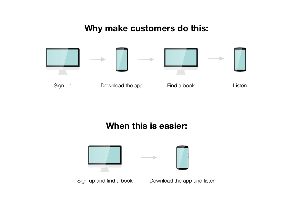
It’s a big ask when you force people to switch devices to use your product. Android users were safe in this regard as they were able to sign up, browse, purchase, and listen to their books all through the Android app.
The iOS users were less fortunate, as they are unable to browse or buy books with their app. Meaning, we discovered some very painful user journeys between signing up and listening. This experience forces people to jump from desktop to mobile, back to desktop and then back again to the mobile app.
As an experience designer seeing this journey I was dying I was dead.
Helping people find the right book.
For customers to find the service valuable and continue using it, they need to be able to find books they enjoy.
Market research shows that customers use the service for three primary reasons. They use it to learn something new, be entertained, or to relax. This was another way to improve how we help people find the right book. By employing the “jobs to be done” framework, we can offer customers a different way to narrow down what they might like.
We don’t need more content, we need smarter content.
– Sarah Richards, Content Design (one of my favourite books)
This audiobook service is available on two websites: its own, and its parent company’s. Both sites also have a mobile site which can also be different from the desktop site. On top of this, the app is available on iOS and Android. That’s a lot of places for messaging to appear – a Herculean task to keep it all consistent. To streamline copywriting, we created modules of content that could be reused. Most importantly, we started a content style guide to keep it all consistent
What I learned
This was my first experience working in a country where both the language and culture were significantly different from what I was familiar with. I embraced the learning curve and adapted to new communication styles. Most importantly, I enjoyed building a foundation rooted in universal design and content principles, which seamlessly connected the service’s various channels.

Photo by bantersnaps on Unsplash.


