Financial advice technology for retirement and investment.
People who speak to their financial advisers about retirement want to know what the span of their retirement will look like. They need to know if the strategy from their advisers will help meet their retirement goals, or what to do if it falls short.
At the same time, financial advisers need to be able to clearly and intuitively communicate what the customer can expect each year based on the given advice. They need to assure the customer that the plan is robust in order to earn trust and build rapport.
For this project I collaborated closely with the product manager and business analyst to understand customer and business needs. Working alongside engineers and SMEs, I designed and delivered graphs for retirement income projections.

What we know
Speaking with subject matter experts (financial advisers), we understood that customers provide information about themselves and retirement projections are generated based on that data. The adviser then creates a strategy with the retirement products they offer, and then this plan is presented back to the customer.
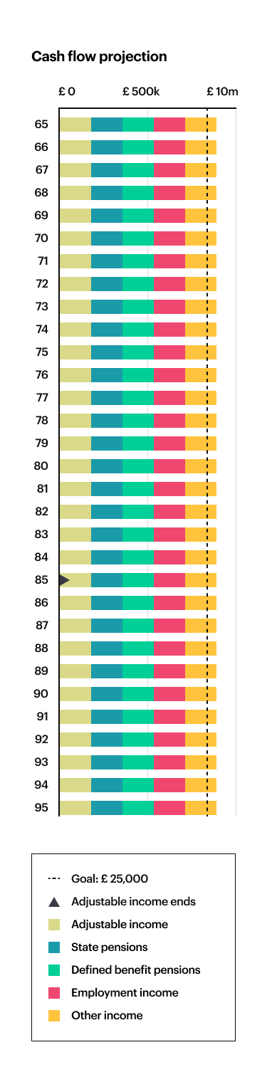
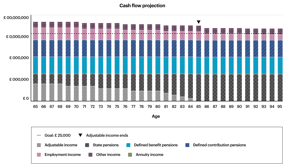
In this journey, advisers and customers needed a talking point and reference to see what happens to the multiple sources of the customer’s income in the entire span of retirement.
From research interviews, we also learned that customers liked the advisers sharing visualisations with them on concept designs that represent retirement recommendations.

Sue explains her positivity towards the adviser sharing the visualisations with her on the concept designs.

Peter exclaims how the concept design screens are the best thing he’s seen from this financial advice provider.
The challenges we defined based on discovered insights
For end-users
- Customers vary greatly in number income sources, income amount, and time span for their retirement, these all need to be accurately presented
- Customers initially provide an income goal to their adviser, and this should be apparent so they can both see how this goal compares to the projected income over the years
For the business:
- The visual reference for income projections need to be modular as it needs to be used more than once in the retirement planning journey
- As the product is meant to be offered and used by large financial institutions – everything needs to be AA compliant for accessibility – this includes visualisations, charts and graphs
- Internally the team needs to decide whether we use components from an existing design system like IBM Carbon or build custom components from scratch
Problem definition
How might we help customers and advisers understand the short, medium and long term impacts to their retirement income, based on our recommendations?
Developing answers through collaboration


Learning from SMEs
Sketching out elements that are key to representing retirement income over the years and finding various retirement projection graphs to understand how this information is usually displayed.

Working with engineers
I worked with engineers to understand Carbon’s capabilities with visualisations, and we discussed what we would need to alter in the charts to fit our needs.

Finding existing research
I reviewed articles from other researchers on designing graphs. Then I collated these resources and tools for creating and testing accessible graphs.
Eliminating what didn’t work
Pivoting the chart
We rejected the concept to pivot the graph for smaller viewports as it caused confusion in guerrilla tests. The alternative option came out of checking the WCAG guidelines, to keep the graph as-is for smaller devices. It is acceptable to let users scroll horizontally for charts, given that all information is retained.
Showing all income sources
I reviewed initial graph concepts with SMEs for feedback. From the list of all income sources, we determined that It was not practical to display everything. Working together, we limited and prioritised which ones are most common and defined the display order.
Deliver solutions
Vertical stacked bar chart design
After exploring different graphs I determined which one was most suitable – I designed a vertical stacked bar chart which is the most familiar and practical way for advisers and customers to see projected income.


Accessibility
I researched WCAG standards on visualisations, and altered the graphs to comply to AA standards by adding patterns, choosing an accessible colour palette, adding dividing lines between each bar segment.
I also worked with the engineers to ensure they understood what other features need to be built in for compliance, such as each element being readable by screenreader, read in a logical order, and displaying tooltips on click rather than on hover.


Design system documentation

I began documenting guidelines for charts and graphs for the design system. This included accessibility resources and tools if changes need to be made in the future.
What I learned
In this role I learned the various tools advisers use to communicate a financial strategy. I also learned about which details are important to customers when speaking about long term financial planning. This has also been a great chance to understand more about making visualisations accessible.