Pharmaceutical library

A new way to navigate a medical library.

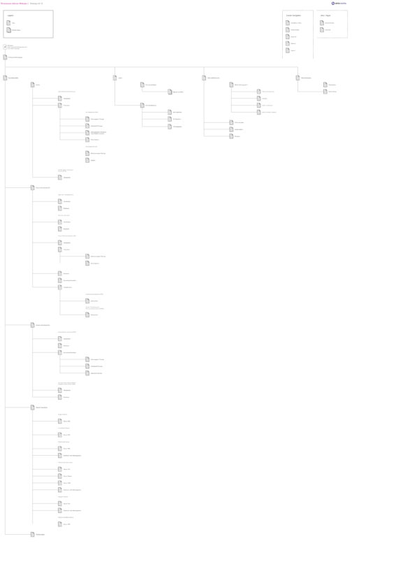
Working together with the lead UX designer and account manager, we audited the site content and developed a new information architecture and content strategy.

Information architecture

After consulting with an industry professional, we reorganised the site structure similar to other popular medical resources – by parent and child conditions, then for each condition to list symptoms, treatment and complications.

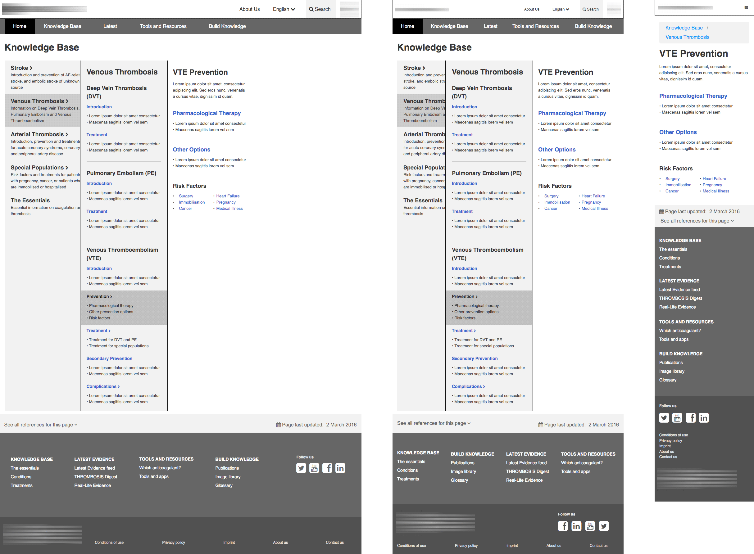
Adaptive wireframes

This was my first time working with Axure Team project with version control. It kept the project organised as multiple members of the team would work on different parts of the same file.

What I learned

I was excited to work on the information architecture for this project, and was glad to have had the time to sift through all of the content available despite my limited medical knowledge. In the end we were very happy to find the design solutions suited for different types of content.
Next Retirement income projection graphs
Copyright © 2022 Rebecca Chen. All rights reserved.